14 min read
The 3 Users of Your UX Portfolio: Who They Are & What They Look For
10 min read
10 min read

If you don’t consider the users of your UX portfolio, it will not stand out. Imagine working on a UX project without doing any research and jumping right into the design. It would not go well. We all know that research and designing for the user is crucial to creating an experience that truly meets their needs. So why is it that when it comes to your portfolio, you don’t consider the user? Sure, maybe you know that UX recruiters and hiring managers are busy … but there’s more to it than that.
If you want your UX portfolio to stand out to recruiters and hiring managers you must consider their needs. Imagine starting your day, in your new UX role where you’ve been for a month or so. And then, your boss has a call with you to tell you about a new project you’ll be working on. She fills you in a bit and then tells you she wants a rough clickable prototype by Friday.
You ask “What information do we have about the users?” to which she replies, “Just wing it!”
Sounds like a disaster, right? Designing anything without an understanding of the user is the surest path to failure. For your design to work, you need to identify the people for whom you’re designing and get to know who they are, what motivates them, and what they need that you can—and can’t—provide. Back to you, your boss, and your design …
The project: Your portfolio.
The person choosing whether to wing it or win it with user research: Your boss.
Your boss: You.
Just like a product, there are clear users of your UX portfolio. But let’s be honest, how much effort have you put into understanding the user of your UX portfolio?
In this article, you’ll develop a better understanding of the three major users of your UX portfolio and what each of them needs as they glance, scroll, scan, and maybe even read your portfolio. Though the UX applicant vetting and interview process varies from company to company, it’s likely that the people involved fall into three categories:
- Human Resources
- Hiring Manager
- Peer Panel and Collaborators
Let’s explore 3 users of your UX portfolio and their personas. To help you get inside the head of these users of your UX portfolio, here are some light persona scenarios loosely based on interviews I’ve done with real-life UX hiring managers and recruiters. These personas will help you understand these people so that you can be prepared to interact with them on email and in interviews.
After you have a better understanding of these “users” of your portfolio, I will show you a structure for how you can visually lay out your UX projects so that the details of your work do not go unnoticed.
Person 1: Human Resources Recruiter
Meet Heather from HR. Heather works as a UX recruiter at a big e-commerce company and is hiring for 5 – 10 positions at any given time. This week, Heather has a deadline to narrow down candidates for a Junior UX Designer role. So far she has 65 applications, and she needs to give the Hiring Manager her short list.
Heather spends about 60 seconds skimming and scanning a combination of the candidates resumes, LinkedIn profiles, and portfolios. As she goes through each candidate’s materials, it’s a rapid process of elimination.
She immediately disqualifies people whose skills don’t match the job requirements. She can’t stand it when links are broken, there are spelling mistakes, and when files are hard to access (eg. websites with complex passwords, or links to Dropbox folders with a maze of folders to peruse.)
Though Heather herself is not a designer, first impressions matter to her and she expects that a candidates’ materials look polished and professional. She doesn’t have time to read every word, which is why she needs the visual presentation of the resume and portfolio to be clean and easy to read. If there’s no hierarchy and too much text, she won’t find the key information she’s looking for.
To give Heather confidence that you do in fact have the skills that match their job description, you may consider:
- Using descriptive titles for each project. A project title such as “Petsmart” or “Petsmart UX” is too vague. And it gets even vaguer if it’s a company that’s not a household name. A specific title would be “UX Design & Prototyping For Petsmart Search Feature”.
- Including summary or table of contents. Remember, recruiters are busy. They may not get to each project in your portfolio. A table of contents or summary section quickly educates people about what they’ll see inside your portfolio. And this is why you need those descriptive project titles (hint, hint).
- Using the “tweet test” when writing. Each section of each page of your portfolio should have one key point, one headline. Always ask yourself if the project would make sense if someone read your headlines. A good tip is to write all your headlines first and try to keep them to the length of a tweet.
Person 2: The Hiring Manager
Meet Latoya. Latoya has been the design manager at the big e-commerce company for 4 years and her team is 16 people now. She is a busy woman and doesn’t have time to review every candidate’s information.
By the time a candidate gets to her, she has confidence that they match the requirements of the job description. Latoya wants to see evidence of your skills and most important of all, she wants to see your thought process a bit—not just what you did but why you did it.
A red flag for Latoya is when a portfolio just has a bunch of screenshots, without any explanation or detail. It doesn’t give her confidence that you can explain your work—or even considered doing so. That startup you worked at, she’s never heard of it! Just showing a wireframe of a dashboard is useless to her because she has no clue what she’s looking at or who the user of what dashboard is and what the dashboard helps them do.
What stands out to Latoya is when she feels like she understands the story of each project in a portfolio. For Latoya, it’s not just enough to show what you did, it’s about the context of what you did.
To give Latoya confidence you can think like a designer rather than just produce deliverables, you may consider:
- Showing your process: If you are an interface designer or visual designer, show the evolution of your designs. But be considerate about what visuals you show. What value does Latoya get from seeing a photo of a wall or post-it notes or a completely illegible whiteboard?
- Explain what happened: Don’t just say “I did 20 usability testing sessions”. It’s more powerful if you expand on that and add details such as what you learned and why you decided to do usability tests to begin with versus other research.
- Adding context to visuals: Visuals are crucial, but without labels and explanations, the user of your UX portfolio will struggle to understand the visual. What’s obvious to you is not obvious to Latoya who’s looking at it for the first time. Including a wireframe of a dashboard? Annotate it up. Help the user of your UX portfolio see which parts of the dashboard are meant to do what.
Person 3: Your potential colleagues
Meet Penelope, Patrick, and Pamela. These people are all members of the design team. Penelope is a senior designer, Patrick is an interface designer, and Pamela is a UX writer. They usually end up interviewing three candidates for each role: they have a group interview with the candidate, and then each has a 1:1 that’s about 20 minutes.
These people see the candidate’s materials before the call so they can come prepared with questions and meaningful discussions. Though not all of them are visual designers, a portfolio that presents detailed content in a clear and professional manner will always stand out to them. To give your potential peers confidence that you’d be a great addition on their team, you must let them into your process. You may consider:
- Discussing what didn’t go well. Not every UX project ends in 20% more conversions. Sometimes we create something, test it, and realize we were wrong. Reveal how you handled parts of the project that didn’t go as planned.
- Addressing team and project dynamics: Consider including details about the project timeline, team members, and any interesting constraints. Was half the team remote? If so, how did that affect the project? Did stakeholders throw a curveball 3 weeks before launch? How did that impact your work?
- Reflecting on lessons learned. There’s a good question this will come up in an interview. For each project, identify some takeaways you can apply to future projects. Being reflective shows that you are a mature and thoughtful design who is not just rushing through a UX methodology you memorized from a bootcamp! But rather, you know how to think like a designer.
How to layout your UX portfolio so it meets the needs of the users
As you create your UX portfolio, the challenge is to provide your users the level of detail they need in the amount of time they have while knowing you’ll never realistically have three versions of your portfolio. The only option is to work on optimizing your portfolio’s layout, so each of those users can easily get what you’re looking for.
This isn’t about having a Master’s in design; it’s just about mastering basic visual principles. Let’s imagine your UX portfolio is a Keynote file that you export to PDF—though these can be easily applied to portfolio websites. The tl;dr is that you need to meet your users’ needs. These are two things I keep in mind to get there:
Tip 1: One headline or idea per slide
This headline should be the most important idea you want to communicate so your reader can get the “gist” of the concept just from scanning that line.
A good exercise is to first write the headlines only so that you have a clear and concise high-level story. Then, go fill in the details. Remember that the user of your UX portfolio doesn’t need to know all the details. There’s a balance and remember that some details you can talk about in an interview versus being literal words in your portfolio.
Tip 2: Add supporting evidence under the headline
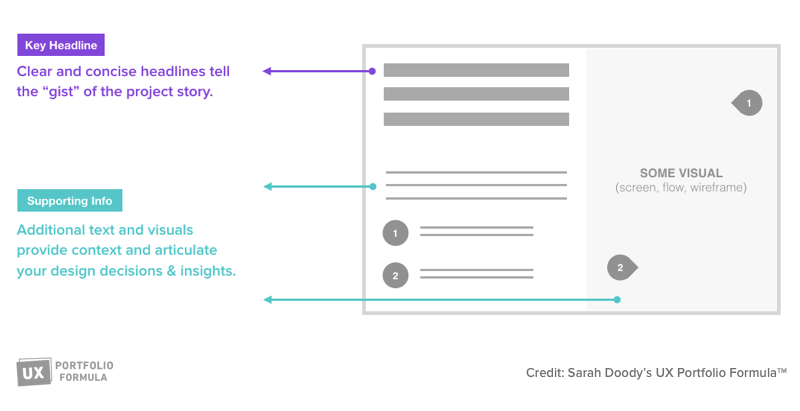
Once you have the headline, the main idea of each slide, you can’t stop there. You need to tell a bit more of the story about that step of the process of message of that specific slide. Below each headline in your UX portfolio you should place additional information support that idea, for the user who may want to reach more, such as the hiring manager or your potential colleagues and peers.
Just like a product, if someone signs in for a free trial and is immediately lost or can’t see the value of your product, they’re out. And they’ll head back to Google and try and find another product to meet their needs.
The same thing applies to your portfolio. By considering the users of your UX portfolio, you’ll have a portfolio that helps communicate the different levels of detail each user needs. And as a bonus, you’ll force yourself to think through the story of each project, and you’ll be that much more prepared for any interviews you may be invited to.
